
HUSKY NAVIGATOR
As new UW graduate students, we encountered a shared problem: feeling unfamiliar with, and often unsafe on, campus.
With the M.S. in Human Centered Design and Engineering course schedule being primarily composed of evening classes (6pm - 10pm) , there were many instances where we found ourselves commuting from campus late at night and feeling unsafe while navigating campus.
Thus, we decided to focus on researching and developing a system that would make students feel safer on campus, especially at night. We initially chose to focus on graduate students as they are typically a population that is both unfamiliar with campus and has commitments that lead them to be on campus during late hours.
Duration: 8 weeks
Role: UX Researcher, UX/UI Designer, Interaction Designer
Tools: Figma, Miro, Google Sheets, Google Forms
Team:
Chinyere Munonye (me)
Aminta Malcom, UX Designer + Visual Designer
Maham Khawar, UX Researcher + Product Manager
Sahana Narendran, UX Researcher + UX/UI Designer
HCDE 518, User-Centered Design Autumn 2025.
This course fulfills a requirement for the M.S. in Human-Centered Design and Engineering program at the University of Washington, Seattle. Instructor, Professor Doug Pyle
01.
THE PROBLEM
Often times students can feel uneasy commuting by themselves, whether it is late at night or during the day. Sometimes, students feel safer when they know that there’s a sense of community that they have. We noticed that this was something that was lacking as graduate students
02.
THE SOLUTION
An interactive kiosk that helps students easily access UW transportation resources.
Designing systems to empower students to learn about the UW Transportation and safety services, connect with fellow UW students, and commute confidently from campus to home.
Husky Navigator has the potential to bridge the gap in students' familiarity with campus safety resources and the community.
RESEARCH
Key Takeaways:
-
Students feel significantly safer commuting during the day vs. night
-
Walking was the most frequented commute option
-
Most students commute alone
-
Most students are aware at various levels of the available UW resources
USER RESEARCH
concentrated on qualitative and quantitative primary research methods including:
-
User Survey Research
-
User In Depth Interviews
-
Direct Observation
-
Moderated Usability Testing
PRIMARY RESEARCH : USER SURVEYS
We conducted a survey as one of our research methods to gather input from a broader group of potential users.
We asked around 20 questions that ranged from demographic questions, to questions regarding student safety and to connection/a sense of community with others on campus. We received 21 responses from graduate students at UW–Seattle.
DEMOGRAPHICS
UNDERSTANDING COMMUTE STYLES


GAUGING PERCEPTION OF SAFETY : NIGHT VS DAYTIME
AWARENESS OF SAFETY RESOURCES


PRIMARY RESEARCH INSIGHTS : USER SURVEYS
Survey results showed that a majority of respondents (>70%) are on campus after 6 p.m. multiple times a week and feel significantly less safe walking at night compared to during the day.
Most respondents commute alone, rely on walking or public transportation, and carry some form of personal safety equipment, yet only a small portion reported feeling a strong sense of community on campus.
PRIMARY RESEARCH : IN DEPTH USER INTERVIEWS
We conducted In-Depth Interviews to facilitate open, in-depth conversations around feelings of safety on campus.
We interviewed 7 participants who were all graduate students among a different range of programs at UW-Seattle.
IDIs typically lasted 30-45 minutes each, where we asked participants questions regarding their typical experiences being on campus at night and how they felt regarding safety.

EMPATHIZE
-
Because safety is often a sensitive and personal topic, in depth interviews (IDI) allow us to create space for participants to share full narratives about their feelings of safety and past unsafe experiences, leading to a deeper understanding of how these experiences influence their commuting behaviors.
-
Building on our initial framing of student safety as a core problem area, IDIs enabled us to move beyond assumptions and gather rich, qualitative insights grounded in real-life experiences and emotions.
-
The themes, motivations, and behavioral “whys” uncovered through the interviews directly informed the development of our personas, ensuring they were rooted in authentic user needs, concerns, and lived experiences.
RESEARCH INSIGHTS : IN DEPTH USER INTERVIEWS
Interviews revealed that environmental factors such as lighting, visible campus security, and the presence of other people significantly increased participants’ feelings of safety when commuting at night.
Most participants were generally aware that safety resources existed. Many lacked clarity on how to use the resources, their names, or where to find more information about them, often referring to them vaguely rather than specifically.
PREVIEW: USER IN DEPTH INTERVIEW TRANSCRIPT

USER PERSONAS
Key Takeaways:
-
The personas synthesize key insights from our research into clear, representative user archetypes.
-
Building on findings from interviews, surveys, and observations, the personas ground our design decisions in realistic user needs, behaviors, and motivations.
-
As we move into sketching, the personas provide a concrete user to design for, helping us ideate with specific goals, constraints, and contexts in mind.

Persona 1 : Noemi P.
-
Archetype : “ the cautious adventurer”
-
Values: higher risk aversion
-
prioritizes the need to commute home safely
-
values connecting with peers
Persona 2 : Jian Li
-
Archetype : “ the social adventurer”
-
Values: Interested in connecting with peers,
-
prioritizes the need to commute home safely,
-
international student newly moved to Seattle

IDEATION
We organized our solutions into categories to highlight the different strategies and potential avenues for implementation.
We held design sprints & review sessions to brainstorm + decide on the most promising solutions.

MIRO: HOW MIGHT WE's BASED ON OUR VALUED CATEGORIES
We organized our solutions into categories to highlight the different strategies and potential avenues for implementation.
We held design sprints & review sessions to brainstorm + decide on the most promising solutions.
Through sketching and ideation we identified three solutions to address our users’ problem:
to connect with one another
&
effectively leverage the existing UW resources in order for them to feel safer on their commute home
FIGMA: CRAZY 8'S IDEATION AFFINITY MAPPING
_edited.png)
IDEATION & SKETCHING : BRAINSTORMING PHASE
INTERACTIVE KIOSK

Guided by our users' issues being limited commuting updates and a low awareness of UW transportation schedules and safety resources, we proposed a solution that, with the help of an electronic board system, would display real-time arrival information for shuttles near key campus locations.
Our first sketch of what we would later call 'Husky Navigator' addresses our users' unfamiliarity with the current UW systems and community. This solution bridges the gap between the current UW safety resources and studentsʼ' needs for safety and community.

The strengths of this design lies in its ability to provide multiple modes of live updates for the transportation resources. This includes the Husky NightRide Shuttle, a known pain point identified through our survey and in depth interviews.
To address the goal of fostering community engagement while improving safety awareness, especially for students commuting in the evening.
This adds a level of interactivity and details that is not currently available in the existing UW transportation tool.
STRENGTHS
GOAL
AWARENESS CAMPAIGN

To maximize the impact of the current systems already in place, such as the NightRide Shuttle and SafeTrip, we would propose a system to spread awareness and ensure graduate students are informed about how to access and use these resources effectively.
This would be done through a variety of different mediums, but notably would include professors embedding the UW Transportation information within their syllabi and presenting these safety systems to students at the beginning of each quarter, and be implemented as a part of each graduate programʼs new student orientation
A key component to enhance engagement with the material presented, would be
to include a representative from either the HuskyNight Ride or the Husky SafeTrip
to speak and answer questions directly as part of the orientation to make the
information more approachable and comprehensible

The strengths of this approach lies in its scalability, efficiency, and its collaborative lens.
By partnering with campus partners and pre-existing
on-campus programs, we can encourage the use of
the existing resources by sharing it in a way that is informative and accessible to many students.
GOAL
STRENGTHS
COMMUTE BUDDY SYSTEMS

The strengths of this system include its focus on building community and
connecting students as a means of increasing feelings of safety.
Meeting the user needs to make connecting with other students more accessible.
STRENGTHS
Guided by our users' issues of communting alone and survey results showing that many students live in similar areas, we chose to focus on a system that would increase communication among students who have similar commutes in terms of routes and timings.
Students would be presented with a digital form designed to gather information
such as their class timings, class locations, and general neighborhood or street
intersections they commute from and to. Based on this information, we would
match students with similar commutes and create a “matchˮ program.
We would share their buddyʼs information—such as name, contact info, and the
reason for the match.
While this system covers scheduled commutes to and from
class, we also want our solution to accommodate more spontaneous commutes
(such as trips to events or library study sessions). To address this, we plan to
create a Slack workspace organized into different channels based on commute
routes.
This adds a level of interactivity and details that is not currently available in the existing UW transportation tool.
While this system covers scheduled commutes to and from class, we also want our solution to accommodate more spontaneous commutes
To address this, we plan to create a Slack workspace organized into different channels based on commute routes.
GOAL
SKETCHING
Key Takeaways:
-
These storyboard sketches were made to explore each of the core flows that expand upon the initial interactive campus map to address our various user needs, from safety to connection.
-
These needs include easy access to the current UW safety resources (Husky NightRide + SafeTrip), as well as for those who walk and commute via public transportation.
IDEATION & SKETCHING : DEFINE AND STORYBOARD
Each flow offers one way for users to interact with the interactive campus map solution, while there are numerous possibilities for interaction, finding intentionality through our personas helped to shape the first round of prototypes.


DESIGN
Key Takeaways:
-
The design process is not linear
-
There will be many iterations, just learning where to put a 📌 in it for the time being.
-
INITIAL USER FLOWS : USER FLOWS
We initially considered the user flows for walkers , public transit, Husky NightRide and Safetrip
_edited.png)
PROCESS USER FLOWS : WALKING, PUBLIC TRANSIT, HUSKY NIGHTRIDE, HUSKY SAFETRIP
For this design, we decided to focus on the task of simplifying the process of the walking and public transit, Husky Nightride, and SafeTrip to help users find the information needed swiftly and easily.
_edited.png)
VERSION 1 MEDIUM FIDELITY PROTOTYPE :
From here, we created the first med-fidelity prototype of our design which we tested among potential users.
USABILITY TESTING : MODERATED
We created version 1 of our final design, incorporating each of our team members’ initials low low-fidelity designs, including interactions to curate the task list for our usability study
We created these wireframes to set a foundation to better understand what our users needs would be in the actualization of a design
Given our short timeline, we found that the incorporation of the different styles allowed for us to get feedback from our participants on their preferences for the user interfaces
This is relevant because prior to this initial study, we had been bouncing ideas around on what the interface would be, but did not have a solid idea of how the design would look in a consolidated manner.
USER STATEMENTS: USER USABILITY TESTING FEEDBACK

INSIGHTS
-
“Super text-heavy. If I’m walking late and night, I want to be able to get through each screen in the shortest amount of time.”
INSIGHTS
-
“There are 4 screens to use on the homepage. Embedding those options as quick options would be good to use as a quick thing in case I am in a rush.”
INSIGHTS
-
“Likes the colors and visual aesthetic . Also says track your shuttle. I think that the buttons on the bottom should be bigger for navigation. And instead of feeling unsafe there should be something called emergency”
As we moved to high-fidelity designs, our design team based our changes on the feedback that we received. Reducing the amount of text on each page, updating the user flow to reduce cognitive fatigue, and unification on the design UI components + branding that we’d be using for our designs.
VERSION 2 ITERATE : HIGH FIDELITY DESIGN
KEY INSIGHTS: USABILITY TESTING
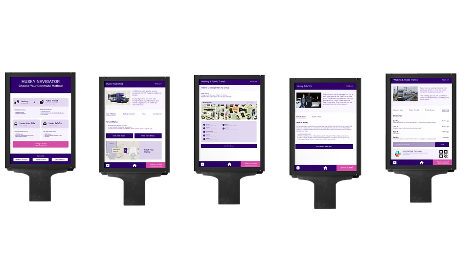
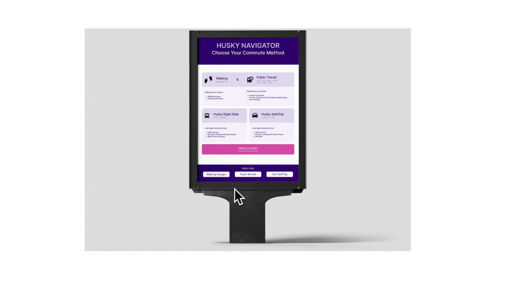
HUSKY NAVIGATOR HOMEPAGE

ITERATION #1 📝
We learned that the start/intro page was unnecessary and added friction. Users preferred diving straight into functionality rather than reading an initial screen. Starting with the four main screens allows them to immediately understand what the tool is for just by looking at it.
We kept the safety first and build connections functions at the bottom of the page for quick links.
MORE INFORMATION: SAFETRIP

ITERATION #1 📝
Based on our user interviews and surveys, we learned that students were not familiar with how many safety transportation systems worked.
We initially designed these pages to be a "one stop shop" with all of the information that they would need to know about each system.

ITERATION #2 ✔️
"Quick options rather than going through each flow. It would be nice to be integrated in the main screen." - Usability Study Participant
Based on the feedback that we received from our participants, we integrated quick links at the bottom of the kiosk screen for people to quickly navigate to specific features, thus enabling experienced users to access their preferred function immediately without navigating deeper into the interface.
From our user feedback, we learned it was best to remove the "safety first and build connections" & allow for the system itself to illustrate that safety is a priority in addition to building connections with your peers.

ITERATION #2 ✔️
"But I had to spend time reading it. Don't know if other people will do
that if its a late night or in a rush kind of thing"
Based on the feedback that we received from our participants, we condensed the wording per screen as it generally was seen as text heavy and participants noted not wanting to pull out their phones multiple times.
WALKING AND PUBLIC TRANSIT

ITERATION #1 📝
In this design, the navigation arrows were placed at the top for people to interact with each feature within the flow easily.

ITERATION #2 ✔️
Based on the feedback that we received from our participants, we learned that buttons placed higher on the screen would be harder to reach, especially for those who are shorter in height or have mobility and/or accessibility needs.
We repositioned primary buttons to be consistently located at the bottom of the screen, and we reduced top-screen text to essential content only. This ensures easier reachability, improves ergonomic comfort, and supports more accessible interaction for all types of users.


ITERATION #1 📝
We learned that participants preferred a consistent, warm, school-spirited color palette over experimenting with different aesthetics for each flow. Consistency in design helped users feel more comfortable and made the interface feel cohesive.
ITERATION #2 ✔️
We updated the prototype to apply a unified color scheme and design system across all screens, using the HuskyNav aesthetic. This creates a consistent visual experience, reinforces brand identity, and aligns with participant preferences for warm, school-spirited colors.
HUSKY NIGHTRIDE
CONNECTION FEATURES


ITERATION #1 📝
We included the transit map for the walking and public flow and general information for individuals who would be interested in joining the walking groups
ITERATION #2 ✔️
"What if I didn't want my full name on a kiosk that everyone could see?
Based on the feedback that we received from our participants, we removed the "full name" component and permitted first names and last name initial. We included the indicator of where you are on the map for clarity and relative distance purposes.
We diversified our walking group to simulate a more realistic walking group. Additionally, we modified the verbiage of "committing" for students to understand the purpose of the walking group and illustrate that it is not a binding experience.


ITERATION #1 📝
This was a simple design to illustrate how the live chat function would work.
Studies showed us that students were confused on how to navigate this page, how the chat function worked, and assumed this was only for the walking group.
ITERATION #2 ✔️
Based on the feedback that we received from our participants, we incorporated the Slack details to clarify how to connect with students who are messaging on the live chat.
To add more clarity, we included informational headers to aid in specifying what the live chat is for and how to get connected.

HUSKY NAVIGATOR
For our high fidelity prototype we created a kiosk design and added the final flows for the system, incorporating basic interactions considering the feedback that we received from our user usability tests .
We created this in order to have an interactive realistic design solution that students could imagine on campus.
We based components that worked from our user feedback such as reducing the amount of texts on each page , combining the walking and public transit features since the flows led to the same pages, and included a how it works page
Learnings
What HuskyNavigator taught me about design
This experience showed me what it is like to work with diverse user experience researchers and designers within a brief timeline. Additionally, I learned a lot about conducting user research and synthesising qualitative insights.
There are a myriad of solutions that can be derived from one problem, but the most important component to always consider the solution that would BEST suit the users you are designing for.
Overall, I had lots of fun collaborating with my peers to think outside of the box, iterate, and create a product that has potential to be impactful for students at the University of Washington. #proud
GRATITUDE
I’d like to thank my fellow designers, researchers, and my instructor, Doug Pyle, for creating such an engaging
(speedy) 10-week experience!
And last but certainly not least, thank you, yes YOU, for checking this out!
